
A silly little piece appeared in The New York Times discussing a hypothesis of a Harvard economics professor that Apple might slow down its operating system ahead of major product releases in an attempt to encourage consumers to upgrade.
One of his students used Google Trends data to investigate this hypothesis. In the article, two graphs are compared — one that shows Google Trends search volume for “iPhone Slow” and the other for “Samsung Galaxy slow”.
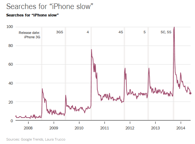
It is shown that the spikes in searches for slow operation of Apple’s products seem to correlate with new iPhone release dates, whereas there are no search spikes in the data for the Samsung Galaxy.
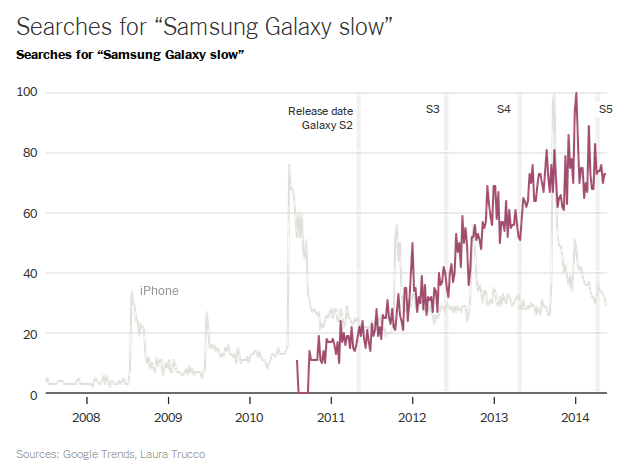
These graphs are horribly misleading on their own. Both products have grown in popularity over the years, so the increase in search volume over time reflects nothing more than their widespread mainstream popularity. This could have easily been removed from the graphs by adjusting these trendlines relative to the “base” searches, e.g. “iPhone” and “Samsung Galaxy”. In the graphs as shown, it’s hard to tell whether little spikes are actually hidden within the compressed and precise trendline for the Samsung Galaxy.
However, the much more important fact is that even a little bit more reflection on these trends would have revealed a much simpler explanation than the one proposed. Perhaps Apple product announcements produce more media fanfare around their release dates, whereas the Samsung Galaxy releases are more muted and roll out gradually across cell phone providers. This seems to jive with my understanding of the massive “Apple effect” in the online tech media that I’ve discovered in my work on Parse.ly, where we regularly see 20% or 30% network news volume spikes around major Apple releases.
How could we investigate this?
Well, using the same data — let’s just go beyond the surface. Let’s simply look at the trend lines that might reflect anticipation around the new product — e.g. “new iPhone” vs “new Samsung Galaxy”. Indeed, when you look at these trendlines, you notice that search volume spikes correlate well with the actual release dates of Apple’s new products, whereas this is not true for Samsung’s product.
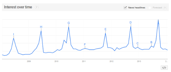
Unsurprisingly, searches for “new iphone” also line up with release dates.
My explanation of this data: Apple’s new product launch strategy is to keep release dates secret for as long as possible, and then release their product widely on a specific day. On that day, they hope to generate a lot of media buzz around their new release, and also put their marketing dollars behind it with coordinated TV campaigns and the like. This results in more people searching about iPhones generally around the same time — specifically, around those release dates. But their searches are not about any one aspect of their iPhone, but basically all aspects. Why it is slow, yes, but also why it is old, where they can buy a new one, how much they can sell their old one for, etc.
Although I was pleased to see the concept discussed in the article that “big data” points out “interesting correlations whose fundamental reasons we unpack in other ways”, it is somewhat disappointing to me that such a credentialed author (economics professor from Harvard) and such a prestigious publication (The New York Times) would not even bother to unpack this specific analysis beyond the surface, and provide a more compelling showcase of the chosen data source.
However, perhaps that was part of the point of the article, which is worth reading for other reasons.
That is: in the age of “big data”, bone-headed analyses backed up by heaps of “supporting evidence” abound. As always, interpretation is everything.